Research and Planning
Horror is a genre with recognisable patterns that happen again and again in which cycles occur with a constant remix of sub-genres, remaking old firms and the increase in filming technology. Down below is an overview of The History of Horror.
 Gothic Horror - In the late 1700's literature got the horror genre started. Developed by writers both within England and America. The term 'Gothic' came from the midevel buildings that the story took place, these locations which are presently conventional consist of dungeons, old castle, gloomy forests and secret passage ways. The famous writers of the Gothic horror genre consisted of Mary Shelley, Bram Stoker and Edgar Allen Poe.
 Horror in the Silent Era - It was from gothic literature where horror films took inspiration, it was popular both in books and theatres at the time. Until 1930's where films could actually be made there were snippets such as 'Spook Tale' by Lumiere Brothers in 1895. In 1896 the first horror film was made 'The Manor
 of the Devil' by Dr.Georges Melies. Elements of gothic horror were evident.
German Expressionism - Heart of horror in film was after the First World War. A style of cinema that emphasised expression on real depictions of the real world. Germans created their style in their cultural bubble from World War 1, grew quickly and creatively and convinced the germane army to take the filming nationally which created the Universum Film Aktiengesellshaft, German lost so they turned filming into commercial profit instead. 1920, The Cabinet of Dr.Caligari. Electricity was still scarce, and the UFO nearly used up all the quota so shadows were painted instead of done with technology. Established German expressionism. They continued this creative expression with films such as Nosferatu. Dawes Plan was offered to Germany to get the economy back into control however many film industries had to get shut down in 1925. Good opportunity for Hollywood as Paramount and MGM lent 4 million to UFO in exchange for calabrol rights to UFA studios, threates and personal. In 1926 it was then called the Parufamet Distribution Company, this agreement moved german expressionism into Hollywood. Artists traveled to the US to work in filming.
Horror learns to scream
Sound had a huge impact on horror, artistic leap. In the 1930's Universal pictures was the start of the cycle . The little three were Universal pictures, Columbia and United Artists. Universal hothic Horror cycle, there first hit was Dracula in 1931. It then continied with Franeknsten, the mummy and The Invisible Man. It lost steam as the titles were reoccuring. By 1948, when Abbott & Costello meet frankenstein Universal retired with monsters in horror. Val Lewton was put in charge for a low-budget divison to produce horrors, and RKO created the title and he made the story. 'Cat People' was the film. By using shadows and lighting instead of makeup and monsters it was a glimpse at the more phsyogolicial aspect of horrors.
Mutated Monster Mash
War - 1950's was a difficult time. Pulp Science Fiction Horror Cycle. Different creatures were created for example the film Godzilla.
Psychology, Sex & Gore
1960's Psycho that shocked the audience into believing horror could be more. Added realistic approach. Hammer Gothic Horror Cycle - adding sex & gore. In full colour. 'The curse of Frankensetin in 1957. (blood, chill colouring). Hammer Horror (7 Frankenstein films, 6 dracula films and 9 Vampire films, 2 Jeklyll and Hydes and 3 mummy films) 'Rocky Horror picture show' another hammer horror style. 'Blood and Babes' Edgar Allen Poe cycle - many important sub-genres that would occur in future decades. Occult Horror Cycle 'The exorcist, The Omen" Late 1970's
Jaws - 1975 created the Shark Horror Cycle adding elements of B Horror with creatures.
'Carrie' - Set the stage for Teen horror cycle (1976)
1979 - 'Alien', remix horrro and science fiction and the remake of 'The thing'
1980's - The Shining (1980) Most must watch for students of horror.
Independent Horror And the Slasher -Low-budget world
Technology increase, the rise of independant film makers meant the rise of different forms of horror.
'The Texas Chainsaw Massacre' rawness of teens inspired more teen horrors/slasher.
1978 - 'Halloween' by John Carpenter most succesful independant horror film ever made. Horror inside everyday subarea
'The evil dead' by Dr Sam Raima - home video tape market
The 90's and modern horror
The slasher horror had ran its course and was made as parody. Teen Horror cycle rebooted by 'Scream' led to 'I know what you did last summer'
Psychological horror stayed popular such as 'The ring'
Unique to modern era 'Torture porn' empahsises intense gore which includes the film 'Saw' by Dr James Wan (2004) and 'Hostel' (2005)
Found footage horror - The Blair Witch project ( Piecing together hand held footage)
Paranormal activity (2007)
Zombie cycle - Presently horror films are surrounded by the modern zombie. Started with '28 days later' danny boyle 2002. Films such as 'The walking dead' and 'World War Z' were created.
The Blair Witch Project (1999)
 Horror films that reach into our instinctive fears that have been hard-wired into us, make watching a film like 'The Blair Watch Project' that much suspenseful. Within this film, we go along with the characters yet instead of them being filmed by an ordinary studio camera the whole time there are snippets of footage as we watch their experience in the forest, making it that more realistic.
This film did not use special effects or digital supernatural creatures, it showed characters getting lost within the woods. This is a convention of a horror film which would be recognisable to the audience watching. However, instead of just a guy in a ski mask following the characters around we see them get lost and undergo a series of suspicious noises in the night and frightening figures hanging from the trees. As they start to lose their minds while their imagination runs wild with all the conspiracies within the woods, they lose food and their smokers making the audience feel even more scared.
The Others (2001)

'The Others' is a mystery set inside a haunted house. This film is filled with many of the generic conventions a horror film in a haunted house would have, for example the violent shocks, dark eerie atmosphere and doors that suddenly shut. Throughout the film it is tense and dark yet quiet. It is also a waiting game as the characters unfold the mystery of the what and who is within the house, maybe a little bit too slow.
This film is located in an isolated house on the island of Jersey, in a house that Grace (Nicole Kidman) and her son and daughter live in, the boy Nicholas (james Bentley) and the girl Anne (Alakina Mann). One day three servants appear who 'responded' to Grace's plee for new servants when her previous ones left without saying goodbye.
The house must always be dark and each 50 doors must be locked before another may open, this is due to Anne and Nicholas (her children) being allergic to sunlight and could possibly die if to come in contact with the sun. This means that throughout the film there is low-key lighting which creates an atmosphere within the film, with the only source of light being the candles.
After watching ‘The Others’ I was able to conduct a detailed analysis into what the conventions of a horror film are. The horror genre is identified through common visual and aural characteristics where the different iconographies/codes and conventions are then identifiable and recognisable to the audience in which their expectation is framed already. These iconographies that are easily recognised to the audience is of the modernist idea of the horror genre, as the approach is the modern side of horror which is generic and seen in many horror films.
The conventional audience expectation of a horror film is to evoke fright panic whilst we see characters go through our hidden worse fears as the suspensful narrative unravels, which is the modernist approach. However some horror films have a sense of post-modernism where the horror offers more than just the simple pleasure of feelings scared for example physical effects (adrenaline), Empathy, a sense of enigma (intrigue, mystery, problem-solving etc), Voyeurism and a sense of community. This expands the present ideologies, giving the audience a different perspective of the horror genre.
Low-key lighting: This form of cinematography is a well-known convention within a horror film as dark scenes evoke suspense and enigma. Low-key lighting can be used to create shadows and other eerie visuals with a scene. This was a huge part in the film ‘The Others’ which also gave me more of an insight into the conventions as throughout the film it was mostly dark, yet it was played upon with candles creating shadows and effects throughout the film.
Settings:
The conventional setting of a horror genre would be anywhere that could connote a sense of isolation and being alone, in which these places normally hold a dark history which entices the evil.
These locations consist of:
- Abandoned house
- Graveyards
- Basements
- Cabins
- Creepy hotels
Within the film ‘The Others’ it gave me a clear perspective on what the conventional setting for a horror film would be. This is because, throughout the film it was shot in an old/creepy looking house on the outskirts away from any other people which is a clear icon of an abandoned house. The house also had a dark history which is what make the film a horror as that is how the narrative unraveled.
The location of my filming will take place at my house, where they will be scenes where she is waking up or has certain suspicions there is someone looking/following her within her own house. This creates a moral panic as the antagonist is invading her security from being within her home which is everyone's worse fear as that is meant to be one of the only places you can truly feel safe within. The rest of the scenes will take place in a parking lot where more stalking will occur and just the general parts of the scene.
Horror Movie Posters
There are many common conventions within a horror film poster that makes it easy for an audience to identify that it is within the horror genre when having a first glance at the poster.
Lighting
Within a conventional horror poster the lighting of the main image, which is normally a character or
Font
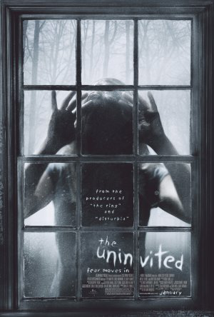
The font within horror posters are very bold in a different colour compared to the background so it is easily stood out. The font is usually ghostly or has sharp connotations depending on what time of horror film it is, for example ‘The Uninvited’ is in white, with a ghostly uneven, wonky font which is very strange matching the narrative of the film.
Colouring
The main colours that can be commonly identified within a horror poster are very dull such as black and grey, with the supported colours that consist of red and white which connotes blood, death as well as heaven and purity which would be se

Background

The background of horror film posters are commonly a very dark, dull colour which creates the atmosphere of the whole poster. With a dark background, only establishing parts of the setting the poster adds enigma to whole poster as the audience would not clearly identify what the main setting of the film will be, which will add mystery and intrigue the audience. Also with the conventional dark background, the audience will straight away notice the foreground image in the centre of the poster as that is the main attraction with supporting what the narrative is about. If the setting/location is within the poster it will usually be an isolated place which is out of view from everyone else. An example of this can be seen within the ‘Friday the 13th’ film poster where the main image is the main focus as the background is dark, with a forest in the background which adds to the conventions as it is an isolated location. This denotes that the film may take place in locations out of the public eye where victims may go and get disrupted by the antagonist.
Structure
 The structure of a horror movie poster is normally placed in a certain way, to grab the audience’s attention in the correct area. For example, the title of the film is usually at the bottom of the poster and the slogan is positioned at the top of the poster. The release date is usually under the institutional information (which is seen in the same font) and the information is in very small font so it does no draw attention away from the main areas of the poster. This can be seen in the horror poster ‘Stranger Things’ where the title is at the bottom, with the slogan at the top of the poster. In addition, the institutional text is also positioned at the bottom.
What are denotations and connotation?
In terms of film posters the denotations refer to the visual elements we can see that are on the page. These elements may include the main image, the background, title and institutional information. The denotation are what is included on the poster which automatically gets the audiences attention and intrigues them to watch the film. The connotations consist of what the denotations make the audience thin about, so the colour red is a signifier of danger, blood and death which enables emotion as well as imagination.

Analysing the ‘Orphan’ film poster I can clearly identify that it is within the horror genre due to the connotations and denotations. This can be identified through the denoted main colour which is red. Red is a connotation of blood, death and danger which signifies that within the narrative there will be elements of danger and evil.
The main image is of a young girl in pigtails which in any other genre it would be an ordinary, innocent girl. The young girl has direct mode of address and very pale skin with a ghostly look as if they are not quite there, her facial expression implies that she has an eerie, demonic vibe which matches the layout of the poster. Also at the top of the poster it says ‘There’s something wrong with Esther’ in bold, which is also indication that the young girl is Esther and she is not quite normal. Another indicate is the tag line ‘You’ll never guess her secret’ which adds to Barthes theory of the enigma code as the audience will be wondering what her secret is and also engages the audience which will keep them intrigued and wanting to watch the film. Also within the background is a small dark house in the far distance which connotes that it is an isolated house, which is a convention of the horror genre. It seems scary due to the denotations of the illuminated red surrounding the house indicating that someone disruptive may happen within that house.
The title of the film is in white, in opposition to the background colour red so the text stands out fully for the audience to see straight away. ‘Orphan’ the title looks as if it has been violently scratched which connotes that an evil presence had written the title, representing the power that the antagonists have within the narrative. The title may support Levi-Strauss theory of binary opposites as it being in white in front of a dark red background may signify that the Orphan is sweet one minute then evil the next.
The use of high-key lighting within the background of the poster has been used to emphasise the isolated the location the character is placed, for it to be recognisable to the audience. The setting is seen to be within the woods/forest with mist surrounded signifying that the main character is the antagonist, as the setting is very conventional to the horror genre. The lighting also creates tension and suspense, creating fear when the audience is looking at the poster.The typography for 'Friday the 13th' is appeared in the colour red, which connotes danger, death and evilness. This is an indication due to the element of foreshadowing the typography created is that there will be elements of death, blood and violence occurring throughout the film. In addition, 'Friday the 13th' is a very specific date which creates enigma coding as the audience will be curious as to what will happen on this date within the film.
Within the poster the main colours are very stereotypical codes to the genre. For example the black, red and grey are associated with terror and darkness which denotes that the film is a horror.
The character stood within the middle of the poster is clearly established as the antagonist within the film. Due to his position in the middle and the low angle shot he appears powerful, viscous and strong implying that he will be feared by many characters and the audience in the film. He is also stood in an isolated area, where most people would be terrified yet his strong body language is the binary opposite. This heightens the suspense and sensation of fear to the audience.The weapon the antagonist is holding, is associated with the horror stereotypes as the knife connotes the film has violence, terror and death involved as the main occurrences.

The iconography within this poster is a clear indication that it is a horror film, as the conventional colours such as red and grey conforms the stereotypes. These colours are related to blood and 'psychological' elements as these colours also reinforces the theme of darkness and possession of the young boy in the middle of the poster.
The technical coding within the poster is a camera shot at a mid-shot of the young boy with direct mode of address centred in the middle. This signifies evil and possession as a young boy being the antagonist is a sub-version from the normal conventions, so it is implied within the text that he has been possessed by some form of demon which can also be seen in his eyes, which are not normal colouring and are very bright. With the dark forces evident, it is clear that the innocence of the boy was taken and influenced through an evil force.
The house in the background adds to the stereotypical elements of the horror genre due to the isolated theme it has, which is also connoted through the dark shadowing and gloomy clouds appearing at the top. It also constructs a message that what could have been a normal household, with an innocent boy has been reinforced within the poster due to the dark, grey colours.
The young boy within the text conforms to Levi-Strauss theory of binary opposites (good vs evil) as the boy is clearly a victim, which is seen with him wearing his pyjamas and being so young however his eyes also conforms that he has been possessed by a darker force which is innocent vs antagonist. The young boy also adds an element of enigma coding to the audience as they will be wondering who possessed the boy and why.
The typography of the title 'Insidious' is all in white with the two words 'si' in red. Even though the red reinforces the horror conventions of blood and death, the white is also a subversion as that connotes heaven and purity. This could also conform to Levi-Strauss theory of binary opposites which is identified with the young boy as well.
How have horror film posters changed over time?
I believe that the horror genre has definitely changed over time in hand with the horror film posters due to the development of the audience, technology and the narrative.
1970-


1980-


1990-


2000-


2010-


Present-


Throughout the years, it is clear that the horror genre has developed and is very different now compared to horror films in the 1970’s, this can be easily depicted through how the horror posters have changed over time. In the 1970’s horror move posters were very bright as opposed to the posters presently, which are all conventionally dark and dull. Also the horror posters supported Laura Mulvey’s theory of the ‘male gaze’ as the women were in the centre of the picture with hardly any clothing and with there bodies on show the attention of males in the 1970’s were present. They also had stereotypical blonde hair which suits the conventions of the damsel in distress within horror films, which is slowly subverting as the years go on. In the 1980’s the horror film posters were still unconventionally bright, with associated colours such as yellow, making the poster stand out to the audience.The 1970’s and 1980’s both have similarities as the characters and other elements featured within the poster are cartoon-like, which connotes that the narrative is not seriously scary and dark.
When it hit the 1990’s horror films become even more sinister and dark, which can be identfied through the horror film posters during that time period. The posters became more dark and dul illuminating the brighter colours and implement black, grey, dark blue and red which are the conventional colours of the horror genre. Even though the posters still had elements of cartoons the images appeared scarier and less fake. In the 2000’s is when the main characters (real-life people) were featured on the covers so the audience had a perspective on who was within the narrative. In 2010 there were no more bright coloured, cartoon-like covers seen in the 1970’s as the horror posters were very dark and dull, sometimes only in black and white and if there was colour it would be red/white. The images were now realistic and appropriate to the narrative. Presently most horror film covers are filled with enigma, where the main antagonist on the cover is not revealed or you can only see a small part of them. Also, the film covers are darker than ever with isolated locations and conventional denotations such as weapons, or a singular object like a candle. The posters today are very much dark containing a lot of meanings yet very simplistic.
The structure of horror film posters throughout the years have changed, only slightly as from the 1970’s to 2000 the film title was not on the bottom of the page but could be seen the in the middle, at the top or not centered. Which is something that is not common presently, as most horror film posters conventionally have the title constructed at the bottom.
Audiences of the Horror genre
I will be forming a detailed Audience Profile for the horror genre's target market as this will give me a perspective on who is watching this genre. With a detailed analysis it will be me relevant information for me to then implement into my film production, where I will have an understanding on what group within the demographic I will be marketing towards. My research will be mainly towards what type of people watch the psychological horror genre as this narrows it down to the exact audience profile most similar to the target market for my short film.
I will be researching psycho-graphics which will give me a clearer insight on what specific audience I believe watches psychological horror films. With this research I am able to identify there likes and dislikes which is beneficial in regards to the creation of promotional packages and other marketing aspects. Psycho-graphic profiles is a heavily analysed outlook on the different people in the audience from there personality to their behaviour rather than only focusing on the simplistic form of identification such as an age and gender.

After researching these different psychographic profiles I believe that the psychologic horror genre would be targeted towards an explorer. This is becomes out of all the different groups someone watching horror would be a thrill-seeker as they would enjoy being scared through seeking sensation and instant effect which is what a horror film wants to conduct with there target market. Also an explorer is typically young and a student which is the target market typically for psychological horror films.
Target audience profile
Age: 15-25
I decided that this was the most suitable age category for a psychological horror as with young adulthood and teen years this age bracket is learning about themselves, developing and trying new things which comes hand in hand with horror films as horror films gives out a thril, which is what this specific group of young people are seeking. Also, the younger audience would feel less negative about the conventional elements within a horror film as violence, blood, sex & gore as opposed to an older audience who may get judgemental.
Gender
For the overall horror genre, I believe that males would watch it more than females purely based on the fact that stereotypically males prefer thrill-seeking and gravitating towards action, violence, blood and gore which can be backed up by video gaming and the large percentage of males that play games (which include violence) compared to females. However, this could be challenged with psychological films as women are more intrigued with sensitive, heavily story lined, emotional narratives which have enigma and elements where it gets the brain working. In opposition, males would prefer for example Slasher films as there is masses of blood, gore and violence within that specific horror genre. So, within my audience profile the target market will have elements of both genders in regards to marketing but it will mainly be targeted towards females for the psychological horror genre.
Social class

I believe my TA would live within a C2 social class where she has an ordinary life and is studying in sixth form/university where she has a part-time job within retail or a local coffee shop to support her funding.
My TA would have an interest in a variety of different music genres such as Pop, alternative and indie as this person is very free-spirited and open-minded so they are always out to try new things, as the same old and consistent routines may get boring over some period. These artists within the genre could consist of 'Melanie Martinez', 'The Beatles', 'Kings of Leon', 'The Script' as well as 'Ellie Goulding'. My TA is likely to be in a relationship as she is a thrill-seeker looking for new challenges as single life may be boring, however explorer's may have shorter-lived relationships due to their free spirt. My TA also has a lot of friends as they ae quite talkative and love meeting new people along the way. Also they will be on most of the social networking sites that are popular within the younger generation presently such as Instagram, Twitter and Snapchat where they are always active posting about their lives and updating their friends on what's going on.
Audience theories within the Horror genre
Stuart Hall is a cultural theorist that suggested how the audience is positioned within mass media texts by social groups and how there are three ways the audience reads a text.
o Dominant reading: The reader accepts the preferred reading, meaning that they read it how they were meant to causing the code to be very transparent and natural.
o Negotiated reading: The reader sort of believes the code and partially accepts the preferred reading, how it is interpreted depends on there own experiences and interests.
o Oppositional reading: This is opposite to the dominant code as the reading has been dismissed and rejected.
Hall was mainly concerned will how much power the media has as certain social values are creating dominant ideologies within the present society.
David Morley's: Morley's audience theory resulted in the understanding that people who were raised in different social backgrounds receive media texts differently. So it differs in regards to a persons social class, gender and ethnicity.
Blumer & Katz: The uses and gratifications theory was suggested by Blumer & Katz which suggested that when choosing a media it has to consist of four main points, which include:
o Identify – when the media allows you to find a person/product recognisable, for example roles models that may have the same values as yourself.
o Educate – when the media allows you to search for relevant information, knowledge and understanding of a particular topic.
o Entertain – when the media allows you to find something that will give enjoyment and happiness away from reality.
o Social interaction – when the media allows you to have communication with other people from all over the world.
Questionnaire
I decided to ask 20 different people for this questionnaire to get reliable feedback, which will further my knowledge about the horror genre. I decided to ask younger people as they are the age group my film production will be aimed at.
1. What age bracket do you fall under?
2. What is your gender?
3. Do you like older horror films or post-modern?
4. Out of these selected genres, which do you prefer other than horror?
5. Dismal in distress or subverted representation on women?
6. What influences you to watch a horror film?
7. Are you more intrigued watching a horror when real-life stories are implemented?
Questionnaire results analysis:
What age bracket do you fall under?
|
Results
|
15-16
|
5
|
17-18
|
10
|
19-20
|
3
|
21+
|
2
|
Majority of the people that completed the questionnaire were aged 17-18, meaning it is more likely their answers will be taken into more consideration.
What is your gender?
|
Results
|
Male
|
12
|
Female
|
8
|
The results show that more males answered the questions, however I made sure to add enough females to make sure questions were answered by both genders to get a clearer perspective. For example, when I introduce my promotional packaging it will be fair to both genders.
Do you like older horror films or post-modern?
|
Results
|
Older
|
3
|
Post-modern
|
17
|
These results give me a clear indication that majority prefer watching post-modern horror films, which is more relatable to the changes within this generation that are presently occurring.
Out of this selection of genres, which do you prefer other than horror?
|
Results
|
Romance
|
3
|
Comedy
|
4
|
Drama
|
1
|
Action
|
6
|
Science Fiction
|
6
|
Crime/thriller
|
0
|
Historical
|
0
|
Documentary
|
0
|
Other
|
0
|
This question was asked so I could have an idea of what other genre elements I could implement into my horror film production. The results showed that majority prefer action and the crime/thriller genre as well as comedy/romance.
Damsel in distress or subverted representation on women?
|
Results
|
Damsel
|
9
|
Subverted
|
11
|
What influences you to watch a horror film?
|
Results
|
Poster
|
2
|
Trailer
|
15
|
Advertising
|
3
|
These results gave me a clear perspective that people are more influenced through trailers, rather than any other promotional tactic. This means that my trailer must be the best promotional product out of the options.
Are you more intrigued watching a horror when real-life stories are implemented?
|
Results
|
Yes
|
14
|
No
|
2
|
Don't mind
|
4
|
Movie Magazine Review Articles
 I will be researching about different movie review articles which will give me indication as to how the layout of mine will look like, as it needs to be as conventional as possible. By focusing on the format and language it will give me enough relevant information to construct an accurate representation of a conventional layout.
The title of the film is placed overlapping the image at the bottom of the image, the text is in white bold writing. This has been constructed so that the title will be easily spotted by the audience. Underneath the title is the subtitle which had been created by the writer saying ‘Who ya gonna call’ this term was used at an attempt to humour the readers as this is a well-known phrase from the song ‘The Ghostbusters’. By implementing corny, witty humour it intrigues the audience and gives them some form of entertainment whilst reading the review. When creating my own film review I will attempt to use some form of humour if it is necessary to the text.
The rest of the page consists of the actual review which is split into three different sections, these different sections consist of the details of the film (plot, genre, release etc), the actual review of the film distributed by the writer as well as the verdict. The language within the text there are references made to the different films that are within the same genre. The actual language within the text is quite informal, containing playful attributes which fits the target market of the film as it is aimed at the younger generation (15-25). Credits to the cast/crew as also been added including comparisons to other films within the horror genre.
Empire:

Total Film:

Little White Lies:

After researching the Empire, Total Film and Little White Lies magazine reviews I am able to fully establish what is expected from a conventional magazine and what the structure is. For example the image is large (normally at the top of the page) with informal language (due to my film being in the horror genre) with aspects of humour to keep the audience entertained.
Analysis of a magazine cover

This is a horror film magazine named ‘Fangoria’ which can easily be depicted at the top of the magazine with bold, white writing with a red outline which is opposed to the conventional dark background. This has been denoted for the audience to get instantly attracted to the title where they will know what film is being featured from first glance. The masthead instantly gives the audience indication that it is of the horror genre due to the sharp points on the font which has connotations of the fangs from a vampire, which represents evil and danger as fags are used to kill. This can also be signified through the outlined masthead in red, which can be denoted as blood with red at the tip of the fangs as well. Above the masthead in bright yellow (to catch the audiences attention) is the text ‘Italian Horror! American Terror! German Gore!’ this shows the reader that it is a national magazine implementing horror from different countries around the world.
The main image centered in the middle is of an antagonist from the horror film ‘Insidious’ which is an instant indicate that the film will be featured within the magazine. Which can also be seen in the title ‘Insidious’ below the image which is the familiar colouring and font of the film making it recognisable to the audience. On the bottom of the magazine is a strip of well-known horror films which implies that only horror films will be featured within the magazine.
Magazine Design

This template is a similar image of what I am planning my magazine cover to look like as I believe this is the conventional layout of a horror magazine.
Practice shots
I also did many practice shots and videos in preparation for my actual film production. This was during lesson when everyone was available, where me and my class went to Buckinghamshire to get some shots which were conventional, as well as learn different techniques along the way. This specific trip gave me the idea to film my actual production within Buckinghamshire and the Stowe area as I believe I could get some great shots, especially when the antagonist is stalking the protagonist.


(Update) It was hard getting to Buckinghamshire and Stowe to film my film production so I decided to stay in my home town which is Northampton.
Planning: Risk Assessment
Planning: Risk Assessment
Hazard
|
Risk
|
Likelihood
|
Consequences
|
Control measure
|
Person who may be harmed
|
Walking around the woods at night
|
Possible fall
|
Very likely
|
Moderate
|
Actors/team staff told to watch their step
|
Actors/Actresses and the rest of the crew
|
Props
|
Accidently hurting themselves with fake explosion or knife
|
Unlikely
|
Major
|
When the fake bomb goes off, everyone should be told to stand away and when the actor is using the knife. Should not be touched off-set.
|
Mainly the actors/actresses
|
Car
|
A car crash could happen whilst filming, sitting in the van
|
Very unlikely
|
Extreme
|
To make sure the person driving the van is very experience, and not filming around a busy road.
|
Actors/actresses and part of the crew
|
Makeup
|
Someone may be allergic to the makeup
|
Unlikely
|
Major
|
Prior to putting the makeup on, we would check the products in the makeup and make sure no one is allergic to it.
|
All the actors/actresses
|
Planning: Shot Schedule
Shot
|
Location
|
Time
|
Items
|
Establishing shots
|
At the house
|
24th October
|
· Camera
· Tri-pod
|
Antagonist shots - (point of view, low angle)
|
Parking Lot & House
|
28th October
|
· Camera
· Tri-pod
· Lighting (dark)
· Costume
|
Main content of the film
|
My house & parking lot stairs
|
1-8th November
|
· Camera
· Tri-pod
· Lighting
· Makeup
· Costume
|
I decided to make a shot schedule for when the different shots within my film will take place as well as what specific area it will be held. I have done this so I remain organised and do not get confused what time different scenes are. This was also keep the crew and the actor/actress aware when they will need to be free.


Comments
Post a Comment