Horror Film Posters Analysis
Horror Movie Posters
There are many common conventions within a horror film poster that makes it easy for an audience to identify that it is within the horror genre when having a first glance at the poster.
Lighting
Within a conventional horror poster the lighting of the main image, which is normally a character or
Font
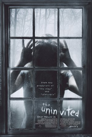
The font within horror posters are very bold in a different colour compared to the background so it is easily stood out. The font is usually ghostly or has sharp connotations depending on what time of horror film it is, for example ‘The Uninvited’ is in white, with a ghostly uneven, wonky font which is very strange matching the narrative of the film.
Colouring
The main colours that can be commonly identified within a horror poster are very dull such as black and grey, with the supported colours that consist of red and white which connotes blood, death as well as heaven and purity which would be se

Background

The background of horror film posters are commonly a very dark, dull colour which creates the atmosphere of the whole poster. With a dark background, only establishing parts of the setting the poster adds enigma to whole poster as the audience would not clearly identify what the main setting of the film will be, which will add mystery and intrigue the audience. Also with the conventional dark background, the audience will straight away notice the foreground image in the centre of the poster as that is the main attraction with supporting what the narrative is about. If the setting/location is within the poster it will usually be an isolated place which is out of view from everyone else. An example of this can be seen within the ‘Friday the 13th’ film poster where the main image is the main focus as the background is dark, with a forest in the background which adds to the conventions as it is an isolated location. This denotes that the film may take place in locations out of the public eye where victims may go and get disrupted by the antagonist.
Structure
 The structure of a horror movie poster is normally placed in a certain way, to grab the audience’s attention in the correct area. For example, the title of the film is usually at the bottom of the poster and the slogan is positioned at the top of the poster. The release date is usually under the institutional information (which is seen in the same font) and the information is in very small font so it does no draw attention away from the main areas of the poster. This can be seen in the horror poster ‘Stranger Things’ where the title is at the bottom, with the slogan at the top of the poster. In addition, the institutional text is also positioned at the bottom.
What are denotations and connotation?
In terms of film posters the denotations refer to the visual elements we can see that are on the page. These elements may include the main image, the background, title and institutional information. The denotation are what is included on the poster which automatically gets the audiences attention and intrigues them to watch the film. The connotations consist of what the denotations make the audience thin about, so the colour red is a signifier of danger, blood and death which enables emotion as well as imagination.

Analysing the ‘Orphan’ film poster I can clearly identify that it is within the horror genre due to the connotations and denotations. This can be identified through the denoted main colour which is red. Red is a connotation of blood, death and danger which signifies that within the narrative there will be elements of danger and evil.
The main image is of a young girl in pigtails which in any other genre it would be an ordinary, innocent girl. The young girl has direct mode of address and very pale skin with a ghostly look as if they are not quite there, her facial expression implies that she has an eerie, demonic vibe which matches the layout of the poster. Also at the top of the poster it says ‘There’s something wrong with Esther’ in bold, which is also indication that the young girl is Esther and she is not quite normal. Another indicate is the tag line ‘You’ll never guess her secret’ which adds to Barthes theory of the enigma code as the audience will be wondering what her secret is and also engages the audience which will keep them intrigued and wanting to watch the film. Also within the background is a small dark house in the far distance which connotes that it is an isolated house, which is a convention of the horror genre. It seems scary due to the denotations of the illuminated red surrounding the house indicating that someone disruptive may happen within that house.
The title of the film is in white, in opposition to the background colour red so the text stands out fully for the audience to see straight away. ‘Orphan’ the title looks as if it has been violently scratched which connotes that an evil presence had written the title, representing the power that the antagonists have within the narrative. The title may support Levi-Strauss theory of binary opposites as it being in white in front of a dark red background may signify that the Orphan is sweet one minute then evil the next.
The use of high-key lighting within the background of the poster has been used to emphasise the isolated the location the character is placed, for it to be recognisable to the audience. The setting is seen to be within the woods/forest with mist surrounded signifying that the main character is the antagonist, as the setting is very conventional to the horror genre. The lighting also creates tension and suspense, creating fear when the audience is looking at the poster.The typography for 'Friday the 13th' is appeared in the colour red, which connotes danger, death and evilness. This is an indication due to the element of foreshadowing the typography created is that there will be elements of death, blood and violence occurring throughout the film. In addition, 'Friday the 13th' is a very specific date which creates enigma coding as the audience will be curious as to what will happen on this date within the film.
Within the poster the main colours are very stereotypical codes to the genre. For example the black, red and grey are associated with terror and darkness which denotes that the film is a horror.
The character stood within the middle of the poster is clearly established as the antagonist within the film. Due to his position in the middle and the low angle shot he appears powerful, viscous and strong implying that he will be feared by many characters and the audience in the film. He is also stood in an isolated area, where most people would be terrified yet his strong body language is the binary opposite. This heightens the suspense and sensation of fear to the audience.The weapon the antagonist is holding, is associated with the horror stereotypes as the knife connotes the film has violence, terror and death involved as the main occurrences.

The iconography within this poster is a clear indication that it is a horror film, as the conventional colours such as red and grey conforms the stereotypes. These colours are related to blood and 'psychological' elements as these colours also reinforces the theme of darkness and possession of the young boy in the middle of the poster.
The technical coding within the poster is a camera shot at a mid-shot of the young boy with direct mode of address centred in the middle. This signifies evil and possession as a young boy being the antagonist is a sub-version from the normal conventions, so it is implied within the text that he has been possessed by some form of demon which can also be seen in his eyes, which are not normal colouring and are very bright. With the dark forces evident, it is clear that the innocence of the boy was taken and influenced through an evil force.
The house in the background adds to the stereotypical elements of the horror genre due to the isolated theme it has, which is also connoted through the dark shadowing and gloomy clouds appearing at the top. It also constructs a message that what could have been a normal household, with an innocent boy has been reinforced within the poster due to the dark, grey colours.
The young boy within the text conforms to Levi-Strauss theory of binary opposites (good vs evil) as the boy is clearly a victim, which is seen with him wearing his pyjamas and being so young however his eyes also conforms that he has been possessed by a darker force which is innocent vs antagonist. The young boy also adds an element of enigma coding to the audience as they will be wondering who possessed the boy and why.
The typography of the title 'Insidious' is all in white with the two words 'si' in red. Even though the red reinforces the horror conventions of blood and death, the white is also a subversion as that connotes heaven and purity. This could also conform to Levi-Strauss theory of binary opposites which is identified with the young boy as well.
How have horror film posters changed over time?
I believe that the horror genre has definitely changed over time in hand with the horror film posters due to the development of the audience, technology and the narrative.
1970-


1980-


1990-


2000-


2010-


Present-


Throughout the years, it is clear that the horror genre has developed and is very different now compared to horror films in the 1970’s, this can be easily depicted through how the horror posters have changed over time. In the 1970’s horror move posters were very bright as opposed to the posters presently, which are all conventionally dark and dull. Also the horror posters supported Laura Mulvey’s theory of the ‘male gaze’ as the women were in the centre of the picture with hardly any clothing and with there bodies on show the attention of males in the 1970’s were present. They also had stereotypical blonde hair which suits the conventions of the damsel in distress within horror films, which is slowly subverting as the years go on. In the 1980’s the horror film posters were still unconventionally bright, with associated colours such as yellow, making the poster stand out to the audience.The 1970’s and 1980’s both have similarities as the characters and other elements featured within the poster are cartoon-like, which connotes that the narrative is not seriously scary and dark.
When it hit the 1990’s horror films become even more sinister and dark, which can be identfied through the horror film posters during that time period. The posters became more dark and dul illuminating the brighter colours and implement black, grey, dark blue and red which are the conventional colours of the horror genre. Even though the posters still had elements of cartoons the images appeared scarier and less fake. In the 2000’s is when the main characters (real-life people) were featured on the covers so the audience had a perspective on who was within the narrative. In 2010 there were no more bright coloured, cartoon-like covers seen in the 1970’s as the horror posters were very dark and dull, sometimes only in black and white and if there was colour it would be red/white. The images were now realistic and appropriate to the narrative. Presently most horror film covers are filled with enigma, where the main antagonist on the cover is not revealed or you can only see a small part of them. Also, the film covers are darker than ever with isolated locations and conventional denotations such as weapons, or a singular object like a candle. The posters today are very much dark containing a lot of meanings yet very simplistic.
The structure of horror film posters throughout the years have changed, only slightly as from the 1970’s to 2000 the film title was not on the bottom of the page but could be seen the in the middle, at the top or not centered. Which is something that is not common presently, as most horror film posters conventionally have the title constructed at the bottom.

Comments
Post a Comment